" height="573.0299999999999px" id="wcoMtyMWm" width="335.94000000000005px"/><path d="M 124.12 0 L 0 0 L 0 8.92 C -0.13 8.79 125.6 8.92 125.6 8.92 C 286.88 8.92 362.69 124.86 362.69 281.68 C 362.69 438.5 278.71 564.1 119.66 564.1 L 0 564.1 C 0 564.1 0.17 572.29 0 572.29 L 121.15 573.02 C 295.81 573.02 427.36 445.93 427.36 281.68 C 427.36 117.43 306.21 0 124.12 0 Z" fill="rgb(0, 0, 0)" height="573.0200000000001px" id="ufUGjATyT" transform="translate(336 0)" width="427.3601007418172px"/></g></svg>)
PROJECT OVERVIEW
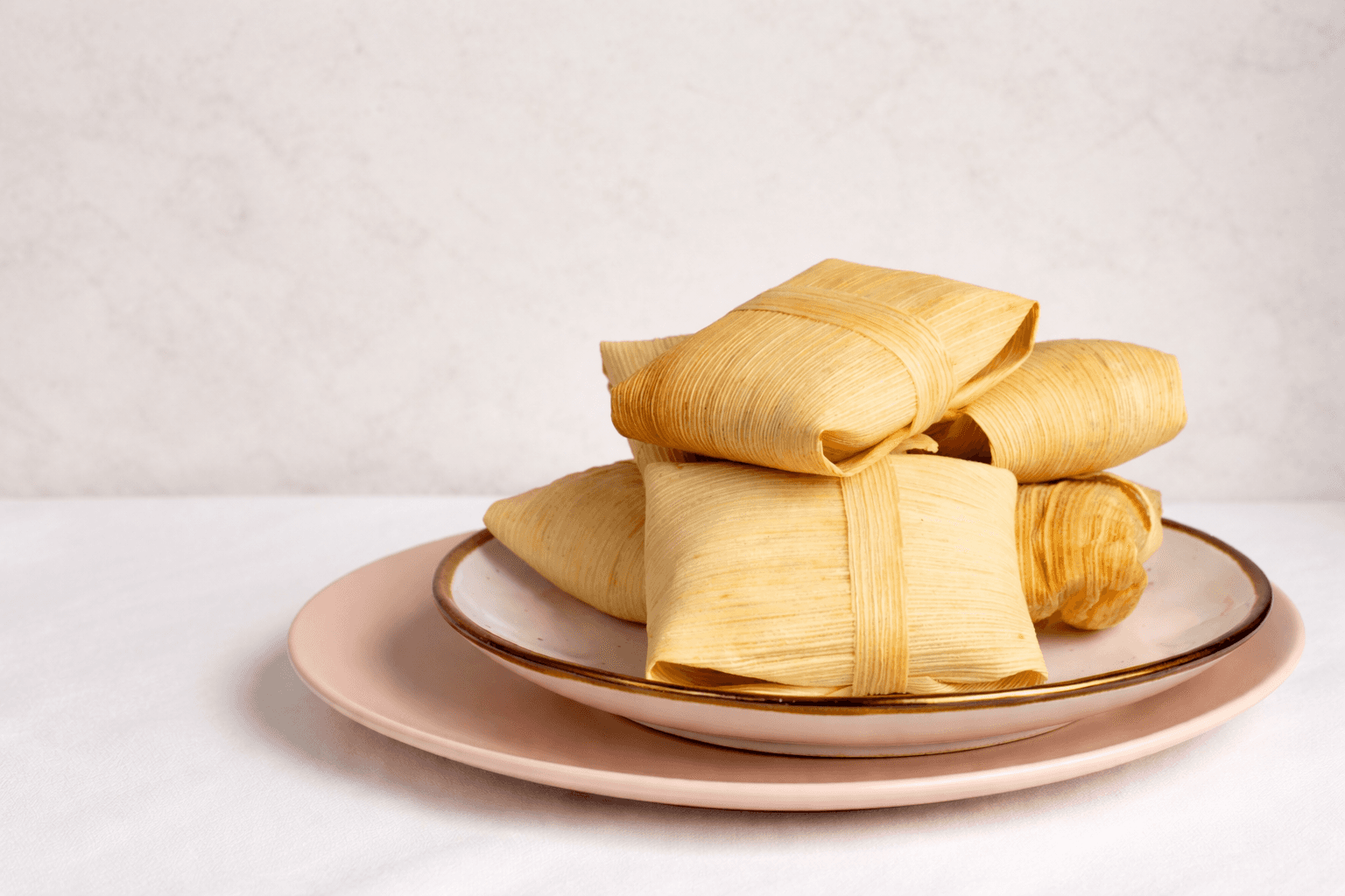
Tamales Santana is a freelance branding project aimed at revitalizing a traditional Mexican food business through a modern and culturally rooted visual identity.
Targeted at younger consumers, families, and tourists, the project combines minimalist aesthetics with strategic colour use to enhance brand recall and emotional connection.
BRAND IDENTITY
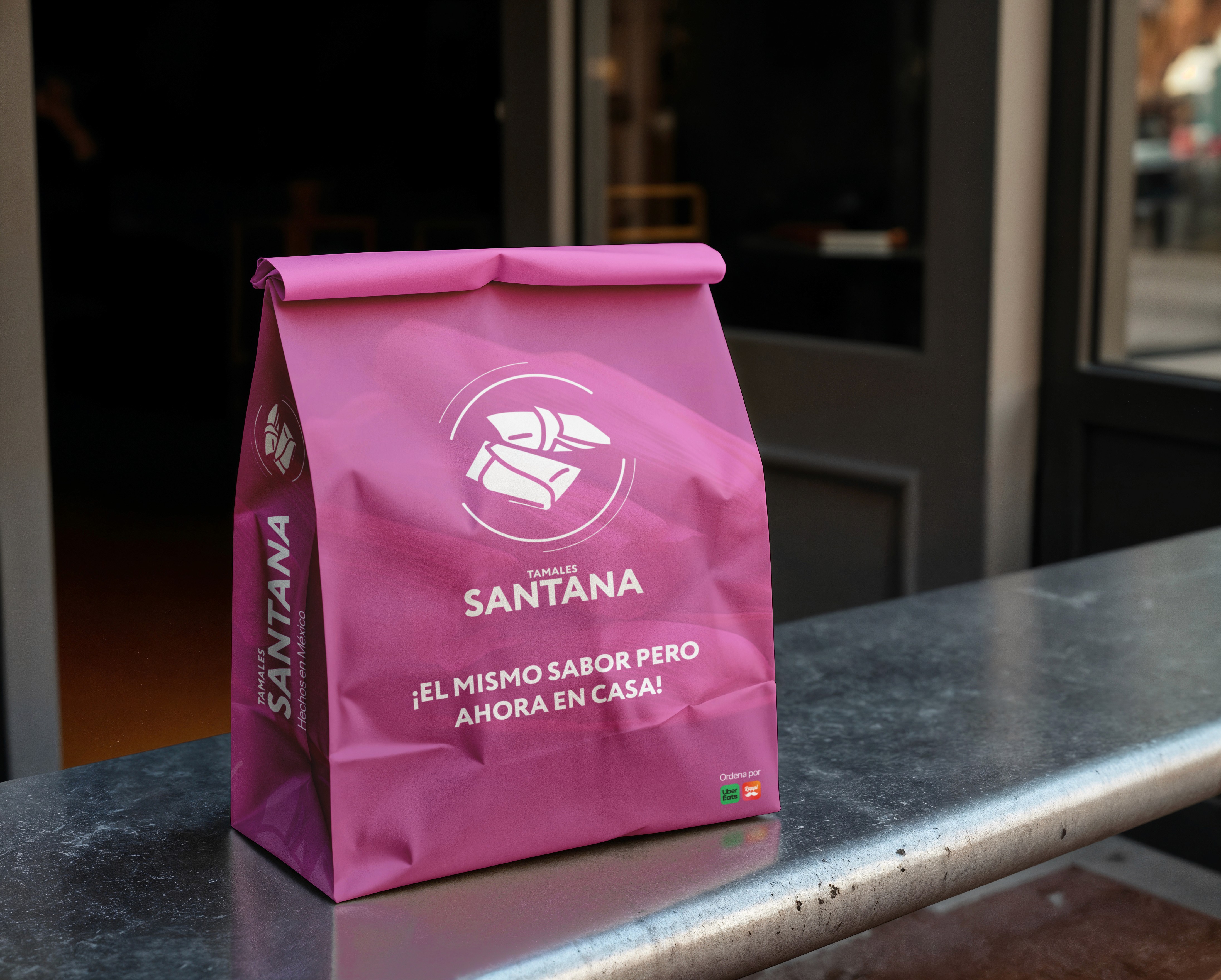
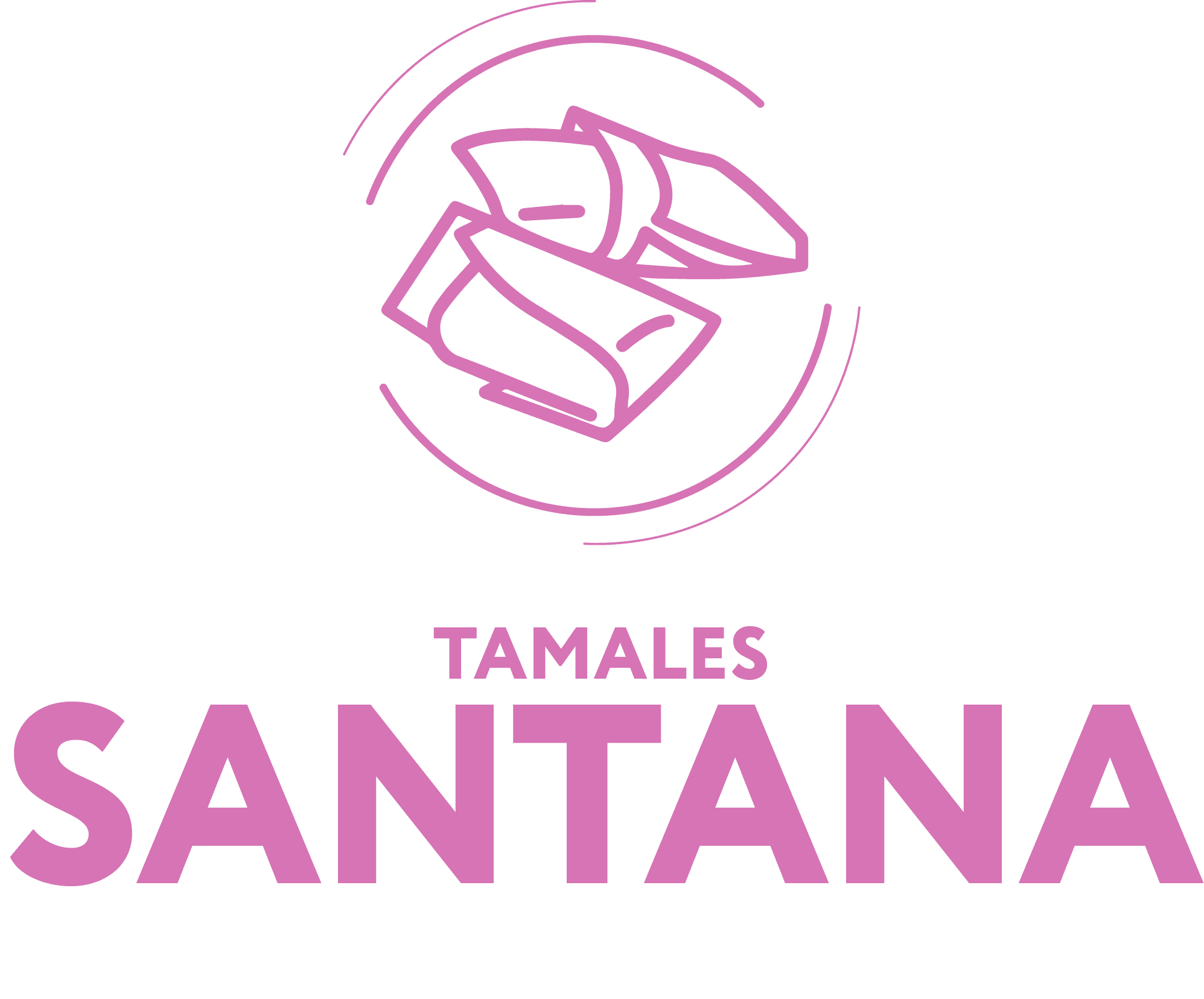
Tamales Santana brand identity reinterprets a traditional Mexican food product through a modern and culturally rooted visual language. The goal was to preserve the warmth and authenticity of homemade tamales while presenting the brand in a fresh and contemporary way.
The visual system combines minimalist line illustrations with a vibrant color palette inspired by Mexican culture. Together with a clean typographic system using Circe Extra Bold and SF Pro, the identity creates a cohesive brand designed to work across packaging, digital platforms, and delivery services.
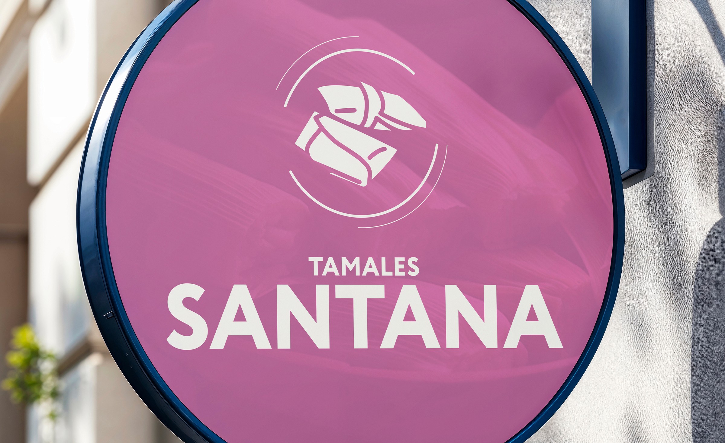
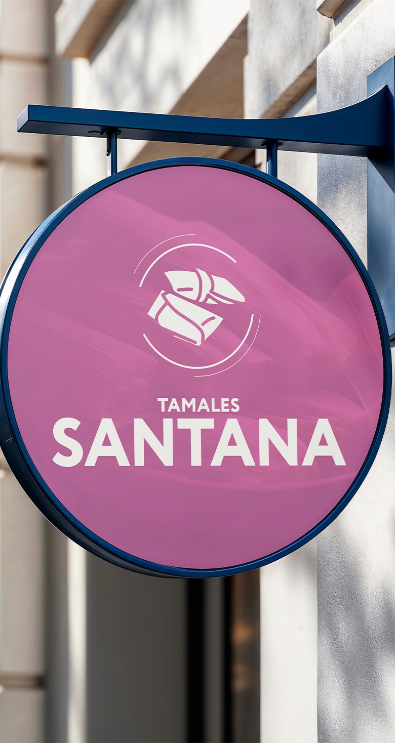
Logotype
Primary Logo

Brandmark

Color Palette
ROSA MEXICANO
Código #e66db9
MORADO
Código ##534661
BLANCO
Código #f7f7f2
NEGRO
Código #000000
Typography
Aa
Circe Extra Bold
Used for headings and brand communication. Its geometric structure gives the brand a modern and bold personality while maintaining strong readability.
Aa
SF Pro
Used for body text and digital interfaces, providing clarity and legibility across web and mobile platforms.
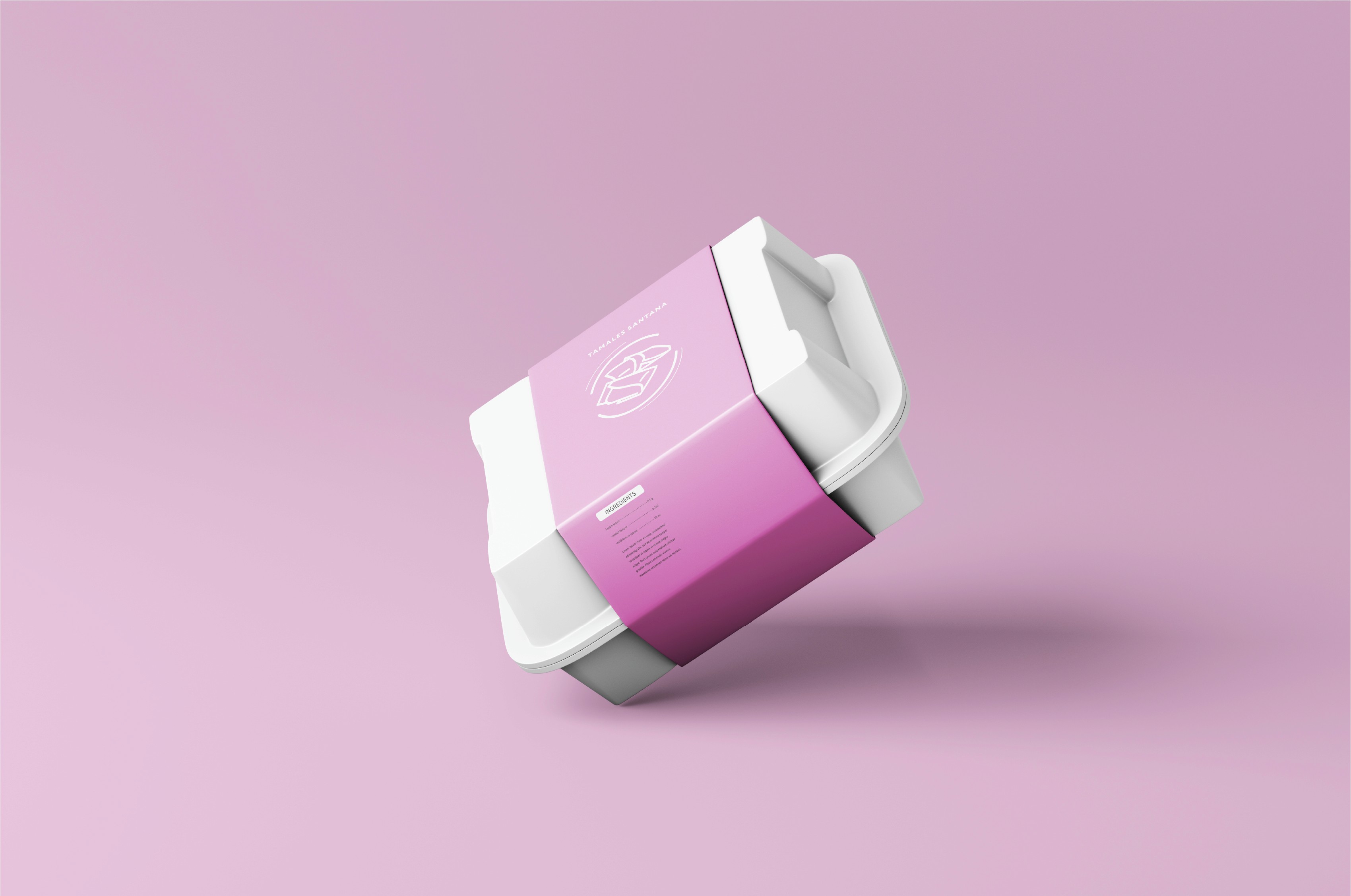
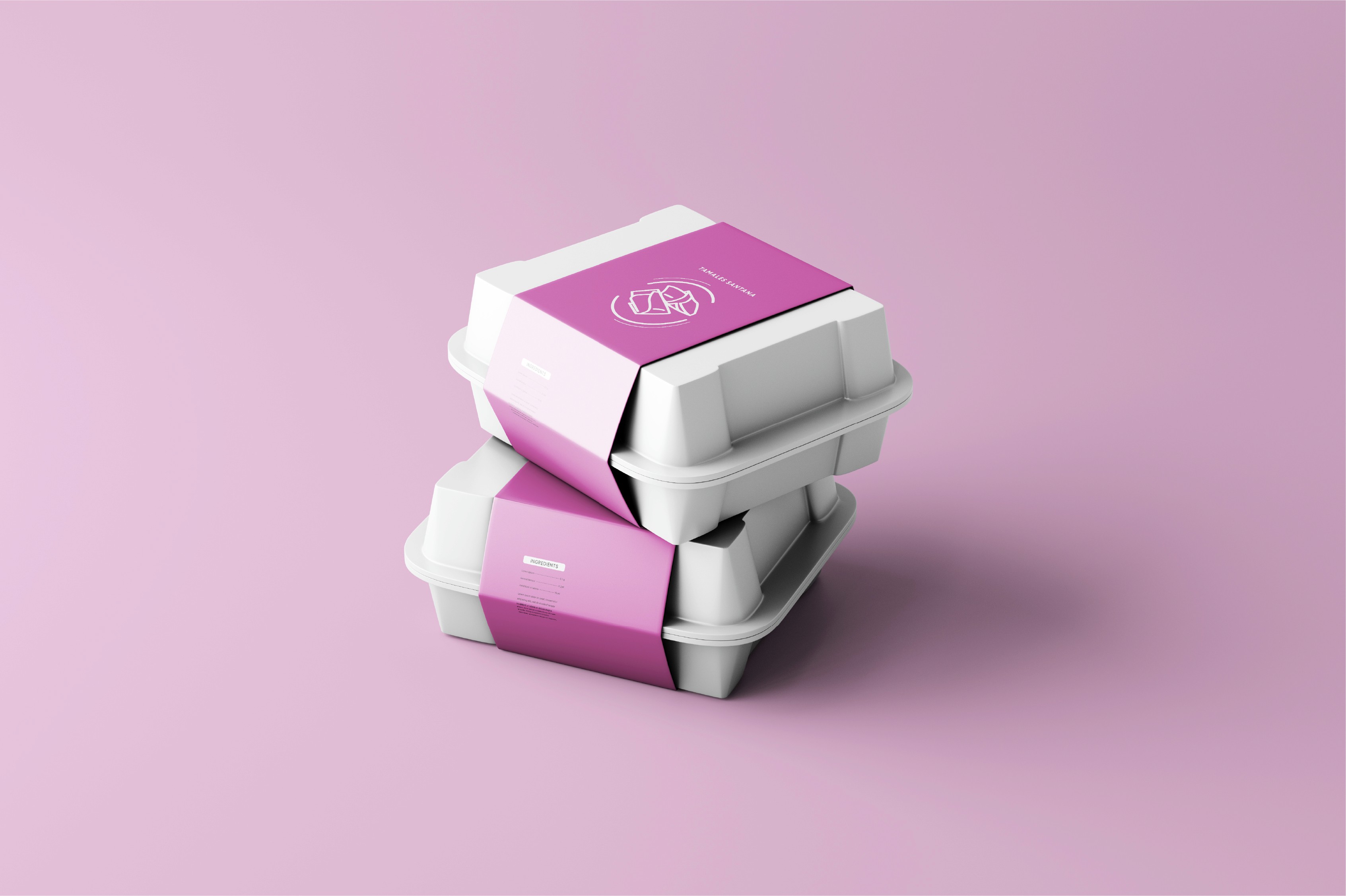
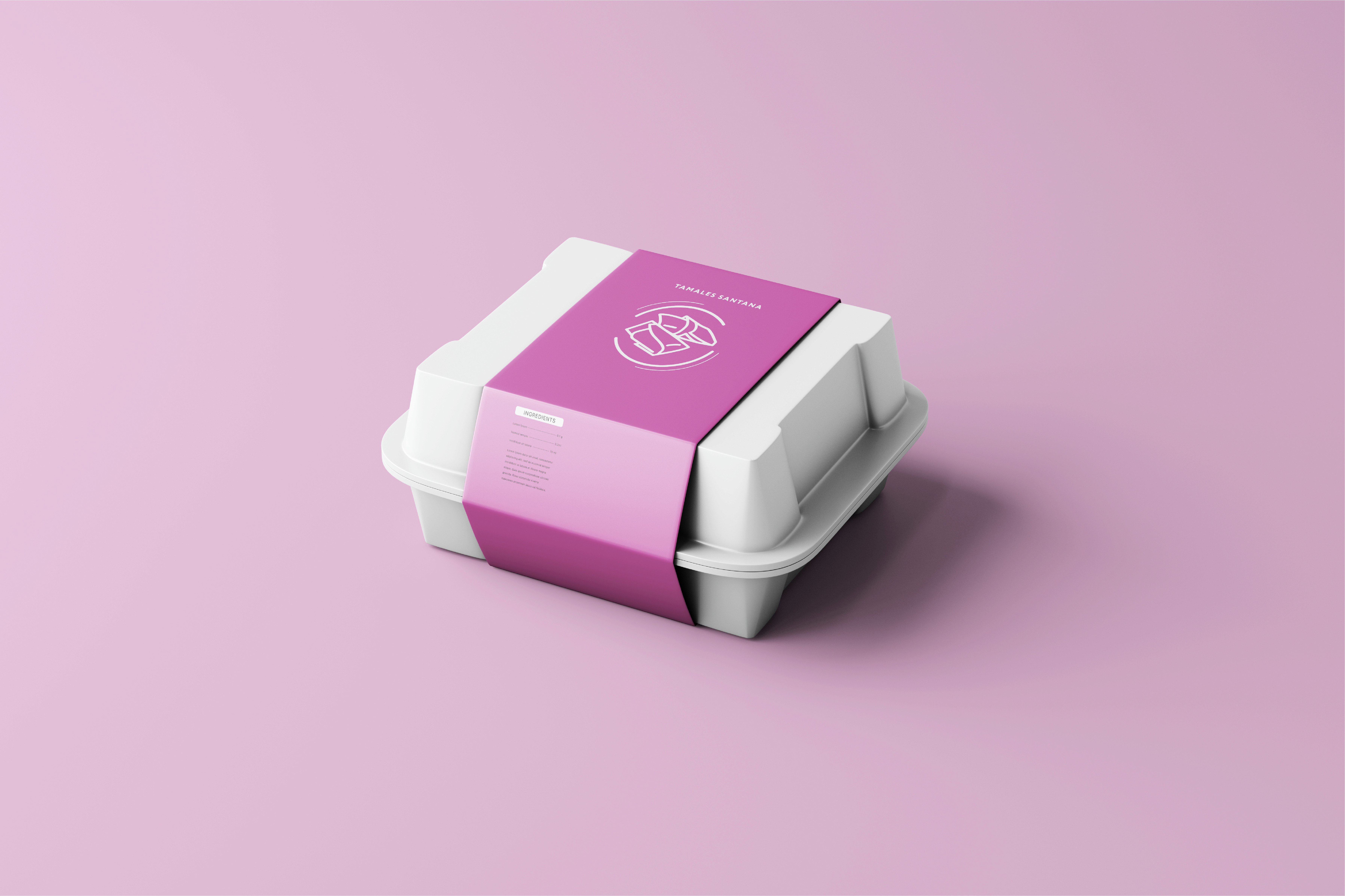
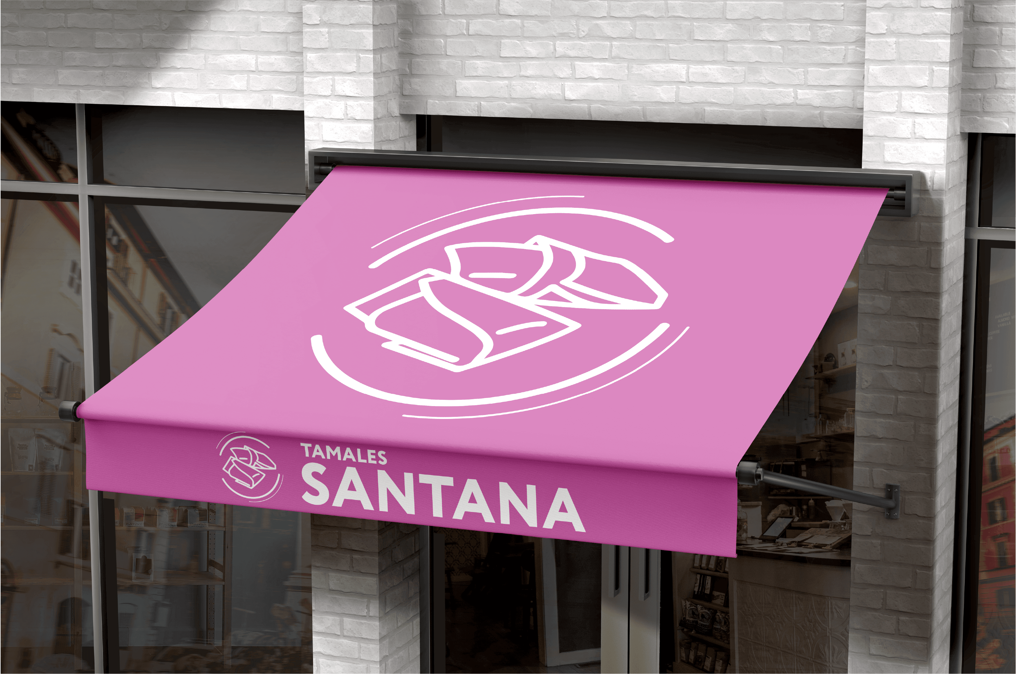
The brand identity was applied to packaging and product presentation to create a recognizable and modern visual experience across physical and digital touchpoints.